Friday, May 27, 2011

Review: Remember The Milk–Personal Task Manager with Great Integrations

remember the milk (rtm) is a very popular and free online task manager for personal usage. In its core it works with lists and allows for great integration into your work flow due to a ton of different services and device apps.

remember the milk - todo and task management work area screenshot

Feature Set: Focus on Lists and Simplicity

The core functionality revolves around lists that you can sort your tasks into. You can create as many lists as you want to – you can even define “smart list” by individual search criteria.

You can email your tasks to rtm and they land in your inbox as do all tasks that you don’t assign to a specific list.

The tasks in remember the milk can have the following properties:

  • part of a list
  • tags
  • due date
  • priority (1, 2, 3 – visualized by color)
  • notes (any kind of text)
  • repeat functionality (daily, weekly and so forth)
  • location (where this task can be completed)

Sharing, Reminders, Overview and Services

Even though rtm offers you the possibility to share tasks, this feature is not at the center of the tool. The process of sharing a task is not very straight forward and you have to invite the person before being able to send them the task.

A very interesting feature is the reminder. As in most tools you can set a due date for you task. In rtm however you can also set how you want to be reminded: Either by a message to your mobile phone, your IM service or email. And how long before the due time you want to me reminded.

The overview section is supposed to help you decide on what to do next. There are only three list: Due today, due tomorrow and overdue. There is also a tag cloud with all your tags.

The feature that for me personally makes rtm so appealing is their integration into other tools and devices.

rememberthemilk overview of services for todo and task manager

There is a whole list of services available:

Without the services I would have probably only given rtm 2 out 5 for feature. Because it focuses on personal usage primarily and apart from the list view there are not many features to help you get things done. But the gmail plugin definitely integrates awesomely into my workflow.

Feature Rating: 3/5

Design and Usability:

Working with Tasks: Completing and Editing

What really bugs me about rtm is the way there main work area. Especially when trying to work through and edit your tasks.

On the top you have tabs with your lists which break into a second row if you have too many lists. This makes it harder to see all your lists. Also there could be a count to the items in each lists displayed – so that you have a better overview of your status.

In center left you have your list with todos in your current list-tab. This basically is fine. However, if you want to edit or change something with your currently selected task, you have to go up all the way beneath the tab-list and select whatever action you like from a dropdown. You cannot really complete a task at the task. Click and done style.

But even worse is the work flow for editing tags or other information of a task. You have check the task and then on the top right side appears an overview of the tasks properties where you click and edit. So if your task is in a list of 20 or 30 tasks the box you edit in is far away from your task and your context.

Creating a Task

The last critique holds true for adding a task. After you put in your tasks title you have to select it and edit its properties as described – this really is a nuissance.

The only real remidy is to learn the shortcuts which makes working with rtm a lot faster.

Design Rating: 2/5

Overall Impression: Well Integrated Personal Task Manager

Sometimes it’s less about the features or the usability – sometimes it’s more about whether or not a tool fits into your workflow. For me remember the milk works well, because it has a has a widget available in a place I use throughout my whole work day: In gmail. I do most of interaction with rtm through this widget, which definitely works for me.

The tool itself lacks a couple of features (like simple task sharing) and the usability could be improved. If you are looking for a free, simple and versatile task manager – remember the milk could be the one for you.

Overall Rating: 3/5


------------------------------------------------------------------------------

For a complete remember the milk guide check out their getting started section.

Sunday, May 22, 2011

Review: Flow – Good Looking Task Management with Collaboration

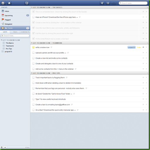
Flow is a web-based task management application, which is also available as an iPhone App. Jarel Remick recently wrote a good review about Flow on appstorm. Therefore I will not go into all the details of flow, but instead urge you to read the review by Jarel Remick.

Design: Nice

I agree with Jarel about the good design. It has written JavaScript all over it, and looks good in it.
flow
There are a few things which I do not like. The items in the left sidebar are quite small – they do not resemble the importance they have. The DropDown-Sign and the Add-Sign on the bottom left are easily overlooked.
Jarel wrote that he liked the speed, with which Flow performs. I have to say I experienced quite a few “Loading” icons – a task manager should not leave you waiting to get into the “Flow”.
Design Rating: 4/5

Features: Collaboration Is Central

Flow makes it easy to delegate tasks and share whole lists of tasks. The collaborator does not even have to have a Flow account – an email address suffices. What bugs me is that you always have to add the collaborators one by one – there are no groups.
Within a Task you can see the whole activity like comments renamings, attachments. In my opinion that is too much. Tasks should be things that can be done within a few hours. There is little need for discussion. On the other hand, I could imagine much discussion in a list as a whole, but there is no such possibility. To me a list comprises many tasks related to each other.
Feature Rating: 4/5


Check out the video introduction to flow:

Overall Impression: Almost Flow

Flow does many things the right way. The design and usability are among the best I have seen. The feature set has much from what one could wish for.
Yet, there are few things which restrain me from getting into the “Flow”: Should I look at all my tasks, or just at the upcoming ones? At which list should I look first? The checked off items distract me a bit from the unfinished tasks.
There is also the price: $9,99 per month per account. You get discounts, if you register you whole team. Still, it is comparatively expensive.
Overall Rating: 4/5

Saturday, May 21, 2011

Review: Action Method Online–Project Management with Lots of Features

Action Method Online is a project management application that is geared towards teams rather then being a straightforward todo or task manager.

action method task and todo manager dashboard screenshot

Feature Set:

The core of Action Method revolves around the Action Sthtml Entwurf kanban boardep. This is basically a todo or task. However, the idea behind the tool is to incorporate some of David Allens “Getting Things Done” methodology in which there are no real todos just next steps you need to take. So, whenever you create a task or todo, think: “What is the next step I need to take to get this done or move it forward? And what is the outcome I want to achieve?”

Action Steps can have the following properties:

  • project
  • delegate (by email invitation)
  • target date
  • time tracking and estimate enabled
  • color

You can filter your tasks with the following options:

  • projects
  • overdue
  • color
  • steps I need to do
  • delegated to others
  • delegated to me
  • active vs. completed

You can manage your todos by either editing them or drag-and-dropping them.

Discussions, Backburners, Events, References, Activity Feed, Contacts, Messaging

As I mentioned before, there are a lot of features that try to make your usage of Action Method more productive:

Discussions are conversatione between people within your organization or team. You get notification as soon as someone posts something new here.

Backburners are ideas that you do not want to act on now – however want to keep them in mind for later.

Events are dates such as milestones, due dates and so forth.

References are simple documents that can be reviewed and edit by everyone in your team.

References and discussions can have files attached (docs, pdfs, images) to them. However this works only in the premium account (12$ per month and user).

Furthermore there is an Activity Feed with an overview of the latest activities in your project, a list of all your contacts (team members) and a possibility to send short messages to your colaborators.

Organizing Todos by Projects

All your actions steps are grouped into projects which can be anything you want them to be – think of them as tags. You can also combine projects into groups.

For a better overview of your current project you can switch to “project view”. Here you get a good impression of what is going on in your project. You can see action steps, discussions, backburners, events and references all in one place.

action method - todo and task management: project view

You also can assign your projects priorities: In “Energy Line” you can set them to high, medium, low or idle.

Desktop Tool: Same as the Browser

Even though there is a desktop tool (via adobe air) which you can download for both Mac and PC – the interface and speed is just the same as in your browser. There is also an Iphone App available.

Overall Feature Impression: A lot of Features and no real Flow

The features all seem to make sense when you work in a team – however, the tool itself becomes very crowded – a lot of things are going on. This results in lack of focus on the actual stuff you want to get done: Your actions, todos, tasks. There are tools for all of those extra features and maybe you do not want to integrate them all in place.

Also the user and work flow does not seem quite intuitive when navigating the features – it seems that sometimes they could be better integrated into one another.

Feature Rating: 3/5

Design and Usability: Nice Look and Feel – Performance and Navigation Could be Better

The overall look and feel is quite appealing. On first glance it is calm, not too much clutter or visual noise.

When you go into detail though, there are a couple of things that are confusing. The hierarchy navigation for example is misleading, because you have your project categories (actions steps, references, etc.) above the project navigation.

Also the main navigation changes when you navigate to different features of the app. Which is a bit of nuissance because you have to navigate back to do something new.

As said before, there could be a bit more of a flow to going through the application. Due to the feature density this surely is not as easy to achieve.

The performance within a certain page is quite decent. Some of the interactions are done without page reloads and thus reload quickly. However, when you switch between features, almost always a page reload is required, which slows the performance down quite a bit. (Navigating to the premium sign-up page even took almost 10 seconds – which seems like quite a bummer.)

Design Rating: 3/5

Overall Impression: Project and Team Management Tool

Being target to teams and corporations and more complex processes (such as discussions, file sharing, and so forth) rather then being a real todo or task manager.

Most of the features seem quite appealing and the overall design is appealing even though it could support your work flows better.

Overall Rating: 3/5

------------------------------------------------------------------

Here are more screenshots over at the Action Method site.

If you are interested in the Action Method Iphone App – take a look here.

------------------------------------------------------------------

If you are interested in simpler todo manager check out our review of wunderlist.