Thursday, June 21, 2012

Only 11% Complete Their Todo Lists – Do You?

An interesting study by linkedin found that 89% of professionals that start todo lists actually do not complete their tasks for a given day.

63% create todo lists. Of those 50% manage them on paper and 45% electronically. Check out one of our todo tools reviews, if you want to get started using a digital todo manager.

Check out the complete study.

Tuesday, January 10, 2012

7 Ways to Being More Productive

In the end todo management is all about being more productive. If you have that part of your life under control and still feel, you could be more productive, check out this post over at inc. magazine: “7 Steps to Incredible Personal Productivity” by Jeff Haden.

He gives advice on how to improve your performance with some small and very practical steps. My two favourites are the first to:

  • Let everyone know – because social commitment is a great motivator.
  • Set a target – because there is no productivity without targets.

If anything else the article will definitely cheer you up and deliver a small productivity boost by itself :)

Monday, January 9, 2012

One App to Rule Them All

rule. launched August 2010 and aimed to be better than all other project management web applications, in particular 37signals’ Basecamp. See this YouTube video on their channel about the aggressive marketing.

Feature Set: Everything In One Place

Rule set out to bring all what is needed for project management together. And they pretty well succeeded. One feature that stands out is the stream. There are streams for every project, for documents and so forth. That way a manager can stay up to date, what is going on.

stream

The other big feature is, of course, Project Management. You can define projects, milestones and tasks. These can be assigned to people, even with a due date. The assignee can mark as done, and add how much he spent on the task.

projects

Further features include Contacts, Wikis, Documents, Mail, Calendar, and Customer Relationship Management. Rule has good tutorials and a tour to get acquainted with all the features.

There are only a few things I would wish for. I would like to see other views on tasks, like for instance a Kanban Board. Also there is no possibility to analyze project data. I would also wish for a time tracker for the tasks.

Feature Rating: 4/5


Design and Usability: Good Structure and Appearance

Rule has a nice interface. Most functionality can be used intuitively. Everything can be found quite easily, and with only a few clicks. Rule only offers the web application – I have not found any mobile or desktop apps.

Rule lacks in keeping the user interested in working on tasks. There is not much fun working with rule and completing tasks. It is better suited for the analytical project manager.

Design and Usability Rating: 4/5


Overall Impression: Nice and Powerful

All in all, rule. has very much of what one can wish for. Most organizations won’t need other apps to help them with their work. The design is good, but lacks the motivational aspect to push the workers towards the goal.

The pricing is fair. 10 Users cost $49/month, 50 Users $99/month. 100 Users cost $199/month with then unlimited projects, deals and storage.

Overall Rating: 4/5

Friday, December 9, 2011

Review HappyTodos: Task and Project Management

Happy Todos is a free collaborative online project management tool with a nice set of functional features.

happytodos task and project manager dashboard

Feature Set: Solid Focus on Useful Todo Management Features

Happy Todos revolves around tasks that are grouped by milestones which in turn are grouped into projects.

You have a dashboard where your todos for today are being shown as well as a list of projects.

In your projects view you see a neat calendar that shows you due dates for milestones and tasks.

When you want to see, what’s happening across your team you can switch to a very basic reports mode where you see, who spent what time working on tasks.

What can you do:

  • create and edit projects with a due date
  • invite other users via email to join the project
  • create a milestone with a due date
  • create a task with an estimate effort, due date and priority
  • track time on a task
  • enter time you spent on a task and comment on your activity
  • edit your priority (either add, rename or remove priorities)
  • set your daily work load in hours (see why next)

Quite straight forward so far.

Intelligent Day Planning and Project Management

At first you don’t really notice it, however there are some smart things happening in the background:

As I mentioned, your dashboard only shows you todos for today. You only get to see high priority todos that match your current work load. That means if you have 3 todos worth 8 hours (standard work load) you automatically only get to see those.

I like this feature because it helps you focus on what is important and achievable.

Also on your dashboard you get to see the progress you are making in your projects. Happy Todos simply adds all estimates and subtracts all time you have already spent. This way you get an automatic update on your status.

Conclusion: Even though the feature set is by not means huge, it seems well concieved and quite functional, especially helping you focus on your work.

Feature Rating: 4/5

happytodos-task-management-project-view

Design and Usability: Lack of Work Flow and Structure

Even though Happy Todos has some dynamic elements to it, the overall work flow seems not really geared towards productive work. You have to change screens and contexts.

Also the overall hierarchie and structure of the elements (projects, milestones, tasks) is not really clear. Everything looks a bit the same and I struggled to instantly understand the core concepts of this todo management tool.

However, the overall design and usability is quite solid. Nothing fancy, not too much noise (elements could be visually better seperated) and the interative features such as drag-and-drop and inline creating of elements well implemented.

Design and Usability Rating: 3/5

Overall Impression: Interesting Feature Set and Improvable Work Flow

For a collaborative project management tool, Happy Todos provides the basic funtionality such as milestones, time tracking and due dates. The “automatic” features such as calendar view, day planning and progress status are very nice and should make you more productive.

The design could have a bit more structure to it in terms of distinguishing elements from one another and more focus on real work flows.

Oh, and it’s free :)

Overall Rating: 4/5

Tuesday, October 25, 2011

Wednesday, September 28, 2011

David Allen on Interruptions, Focus and Use of the Inbox in GTD

Great Productivity Pattern when Dealing with Interruptions

as shown in a short video by David Allen, author of the great productivity book “Getting Things Done”:

As soon as an interruption appears you stick whatever you are working on into the inbasket or inbox. You can continue working on what you dropped there, whenever you have ressources to deal with it.

And don’t forget to make sure you empty your inbox! ; )

Friday, September 2, 2011

Review: Get Paprika – Simple, Personal List-Based Todo and Notes Management

GetPaprika is a very simple tools that let’s you organize your todos and notes in a single list.

getpaprika - list based todo management - view mode

Feature Set: Everything in one Editable List

The core concept of Get Paprika is quite simple and quite different from other todo tools: You can create projects and every project has one editable text page associated to it.

When you switch from view to edit mode you can capture notes, create todos, tags, dates and format your text using basic formatting options via textile.

getpaprika - todo management with a list - edit mode

Once you save your document you can then mark todos as done, filter and search for tags, dates and projects.

There is also an option to share the document via a link that you can send to anybody and they can edit it without signing up. However there is no history or an indication as to who wrote what.

As far as a personal easy-to-use dump for notes and todos GetPaprika does quite well. When working in a team you would wish for more options, more work flows and automation. Such as assignments, automated priorization, reminders and so forth.

Feature rating: 3/5


Design and Usability: Fast Capturing, Slow Working

It only takes a couple of minutes to get to know the concept and basic textile commands to use GetPaprika. So you can start working straight away.

The one-list concept for both notes, todos, dates and tags also helps you get started capturing your stuff pretty fast.

On the other hand, once you have captured your stuff and you want to work with your list, you will find yourself regularly switching to edit mode to either remove, reorder or edit your stuff.

The overall design (look and feel, performance and usability) is very well done, straight forward and low-noise. Quite fun to use, actually.

Design and Usability rating: 3/5


Overall Impression: Great Approach for Capturing Your Stuff

GetPaprika is free, easy and fun. It allows you to quickly capture and format your notes and todos. No real hassle, no complexity. If you are looking for a personal brain dump which still allows you some degree of todo management, GetPaprika seems like a good choice.

If you need more features, more workflow or better collaboration you should maybe take a look at our review of the task manager “flow” or our review of “action method” – a project management tool.

Overall Rating: 3/5

Friday, August 26, 2011

Review: tadalist – Simple and Well Designed Little Todo Management Web App

tadalist is a very simple web based todo manager that allows you to create lists with tasks and check them off when done.

screenshot tadalist - review web based todo management tool

Feature Set: Focus on Todo Management Simplicity

The concept of tadalist is straightforward: Todos are grouped into lists. Thats almost it:

  • change order within list: you can drag and drop todos
  • edit and delete todos
  • mark todos as done
  • share lists with others either via a link (non-editable) or via email (permission to edit the list)
  • rss feed for lists and todos

There is really nothing distracting you from creating and working with your todos. However the tool is primarily aimed for personal use and offers little or no flexibility when trying to filter todos via tags, importance or other properties.

Feature Rating: 1/5

Design and Usability: Great Flow and Details

One of the Design Commandments by famous product designer Dieter Rams says:

“Good design is as little design as possible.”

Tadalist pretty much nails this one on the head. Nothing distracts you from creating and working with your todos.

Even more: The user flow for creating todos is almost impecible. It is fast, you can create them with as little clicks as possbile, as many as you want at a time.

Little details make your todo decisions a little bit easier: The more todos a list contains, the larger the little circle in front of it gets.

Design Rating: 4/5

Overall Impression: Good Design but too Few Featueres

Even though I really enjoyed the flow of tadalist, for real work or even real todo management, tadalist has too little to offer. Once you get past 4 or 5 lists with more then 10 todos in each, filtering, prioritizing and a better interaction view become necessary, in my opinion. For real collaboration features such as assigning tasks seem useful but not implemented in tadalist.

Overall Rating: 2/5

Monday, July 11, 2011

Top 5 Collaboration Todo Management Tools

Over at lifehacker.com Alan Henry has written a blog post with a poll to find out, what their readers most popular todo management is. This top 5 is especially geared towards tools that you can share todos or todo lists with.

Interestingly enough the classical spreadsheets is currently top 1 (with almost 50%) followed by basecamp and rememberthemilk (check out our review of rtm).

Read the complete article on group todo management tools on lifehacker.

Friday, June 10, 2011

Review: GQueues – A Good Task Manager for Google Users


GQueues is an online task management tool with the look and feel of Google. It is not developed by Google, but is build on the Google App Engine and therefore integrates very well with other Google products. Registration is only possible through a Google account.

2011-06-10 15h53_09

Feature Set: Good Focus on Collaboration

Tasks are grouped into queues (e.g. “To Do”), which in turn can be grouped into categories (e.g. “Home”). As the name queue suggests, tasks are prioritized by their order within a queue.

Tasks can have the following properties:

  • subtasks (which in turn can also have subtasks and so forth)
  • tags
  • due date (can be a repeating task)
  • notes
  • person to whom task is delegated (can be more than one)

You can add a tasks in various ways – you can just choose your preferred way:

  • via the application
  • via mail
  • via instant message (Google Chat)
  • via GMail gadget (convert mails into tasks)
  • via bookmarklet
  • via chrome extension

Organization of tasks is pretty easy. You can drag and drop tasks into a different queue. Tasks can be combined according to label and/or due date into smart queues. You can even implement GTD with a personalized set of queues.

One strong side of GQueues is the ability to collaborate. You can share queues with others, and work on them in real time. You can delegate tasks, even to more than one person. They can update you on their work by commenting the task. In the settings you can choose to block people from assigning tasks to you (or explicitly allow). There are also many notification possibilities.

GQueues also works on mobiles and tablets (even offline). It has a extensive integration into Google Calendar. You can easily learn how to use all the features by watching the Video Tutorials.

As you probably already noticed we at teamaton do not like the fixed concept of lists – or queues as with GQueues. We think it is a outdated concept – you should be able to organize your tasks more freely. I did not like the prioritization within queues, but you can just view it as a list of tasks. There could be a little more aid for easy collaboration. Apart from that the feature list is great.

Feature Rating: 4/5

2011-06-10 16h27_38

Design and Usability: Google-esk

GQueues does not hide the G in its name – the design is close to that of Google Tools. Therefore it is easy for Google users to feel at home. But all in all, the design is a little boring, you may not be motivated to actually do the tasks.

GQueues hides away the features until you hover over a task, which makes the screen not so overloaded.You can drag and drop tasks from one queue to another. There is also a keyboard shortcut for everything.

Design Rating: 2/5

Overall Impression: Good Feature-Set But Boring Design

Since GQueues requires a Google account, it probably will only appeal to Google users. Which is fine, because it is integrates nicely with GMail and Google Calendar. These people will also feel comfortable with the google-esk design.

GQueues comes in two versions: lite (free) and full ($25 per year). The difference is that you get Google Calendar Integration, Reminders and Collaboration only with the full account. Companies can buy many accounts at once and get discounts. To me, the price is totally worth the additional features.

Overall Rating: 3/5

Friday, May 27, 2011

Review: Remember The Milk–Personal Task Manager with Great Integrations

remember the milk (rtm) is a very popular and free online task manager for personal usage. In its core it works with lists and allows for great integration into your work flow due to a ton of different services and device apps.

remember the milk - todo and task management work area screenshot

Feature Set: Focus on Lists and Simplicity

The core functionality revolves around lists that you can sort your tasks into. You can create as many lists as you want to – you can even define “smart list” by individual search criteria.

You can email your tasks to rtm and they land in your inbox as do all tasks that you don’t assign to a specific list.

The tasks in remember the milk can have the following properties:

  • part of a list
  • tags
  • due date
  • priority (1, 2, 3 – visualized by color)
  • notes (any kind of text)
  • repeat functionality (daily, weekly and so forth)
  • location (where this task can be completed)

Sharing, Reminders, Overview and Services

Even though rtm offers you the possibility to share tasks, this feature is not at the center of the tool. The process of sharing a task is not very straight forward and you have to invite the person before being able to send them the task.

A very interesting feature is the reminder. As in most tools you can set a due date for you task. In rtm however you can also set how you want to be reminded: Either by a message to your mobile phone, your IM service or email. And how long before the due time you want to me reminded.

The overview section is supposed to help you decide on what to do next. There are only three list: Due today, due tomorrow and overdue. There is also a tag cloud with all your tags.

The feature that for me personally makes rtm so appealing is their integration into other tools and devices.

rememberthemilk overview of services for todo and task manager

There is a whole list of services available:

Without the services I would have probably only given rtm 2 out 5 for feature. Because it focuses on personal usage primarily and apart from the list view there are not many features to help you get things done. But the gmail plugin definitely integrates awesomely into my workflow.

Feature Rating: 3/5

Design and Usability:

Working with Tasks: Completing and Editing

What really bugs me about rtm is the way there main work area. Especially when trying to work through and edit your tasks.

On the top you have tabs with your lists which break into a second row if you have too many lists. This makes it harder to see all your lists. Also there could be a count to the items in each lists displayed – so that you have a better overview of your status.

In center left you have your list with todos in your current list-tab. This basically is fine. However, if you want to edit or change something with your currently selected task, you have to go up all the way beneath the tab-list and select whatever action you like from a dropdown. You cannot really complete a task at the task. Click and done style.

But even worse is the work flow for editing tags or other information of a task. You have check the task and then on the top right side appears an overview of the tasks properties where you click and edit. So if your task is in a list of 20 or 30 tasks the box you edit in is far away from your task and your context.

Creating a Task

The last critique holds true for adding a task. After you put in your tasks title you have to select it and edit its properties as described – this really is a nuissance.

The only real remidy is to learn the shortcuts which makes working with rtm a lot faster.

Design Rating: 2/5

Overall Impression: Well Integrated Personal Task Manager

Sometimes it’s less about the features or the usability – sometimes it’s more about whether or not a tool fits into your workflow. For me remember the milk works well, because it has a has a widget available in a place I use throughout my whole work day: In gmail. I do most of interaction with rtm through this widget, which definitely works for me.

The tool itself lacks a couple of features (like simple task sharing) and the usability could be improved. If you are looking for a free, simple and versatile task manager – remember the milk could be the one for you.

Overall Rating: 3/5


------------------------------------------------------------------------------

For a complete remember the milk guide check out their getting started section.

Sunday, May 22, 2011

Review: Flow – Good Looking Task Management with Collaboration

Flow is a web-based task management application, which is also available as an iPhone App. Jarel Remick recently wrote a good review about Flow on appstorm. Therefore I will not go into all the details of flow, but instead urge you to read the review by Jarel Remick.

Design: Nice

I agree with Jarel about the good design. It has written JavaScript all over it, and looks good in it.
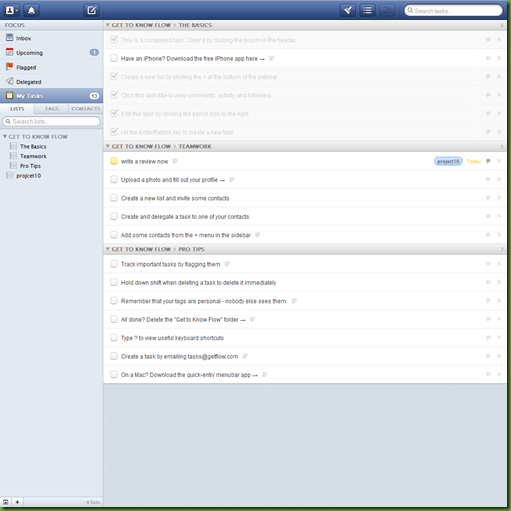
flow
There are a few things which I do not like. The items in the left sidebar are quite small – they do not resemble the importance they have. The DropDown-Sign and the Add-Sign on the bottom left are easily overlooked.
Jarel wrote that he liked the speed, with which Flow performs. I have to say I experienced quite a few “Loading” icons – a task manager should not leave you waiting to get into the “Flow”.
Design Rating: 4/5

Features: Collaboration Is Central

Flow makes it easy to delegate tasks and share whole lists of tasks. The collaborator does not even have to have a Flow account – an email address suffices. What bugs me is that you always have to add the collaborators one by one – there are no groups.
Within a Task you can see the whole activity like comments renamings, attachments. In my opinion that is too much. Tasks should be things that can be done within a few hours. There is little need for discussion. On the other hand, I could imagine much discussion in a list as a whole, but there is no such possibility. To me a list comprises many tasks related to each other.
Feature Rating: 4/5


Check out the video introduction to flow:

Overall Impression: Almost Flow

Flow does many things the right way. The design and usability are among the best I have seen. The feature set has much from what one could wish for.
Yet, there are few things which restrain me from getting into the “Flow”: Should I look at all my tasks, or just at the upcoming ones? At which list should I look first? The checked off items distract me a bit from the unfinished tasks.
There is also the price: $9,99 per month per account. You get discounts, if you register you whole team. Still, it is comparatively expensive.
Overall Rating: 4/5

Saturday, May 21, 2011

Review: Action Method Online–Project Management with Lots of Features

Action Method Online is a project management application that is geared towards teams rather then being a straightforward todo or task manager.

action method task and todo manager dashboard screenshot

Feature Set:

The core of Action Method revolves around the Action Sthtml Entwurf kanban boardep. This is basically a todo or task. However, the idea behind the tool is to incorporate some of David Allens “Getting Things Done” methodology in which there are no real todos just next steps you need to take. So, whenever you create a task or todo, think: “What is the next step I need to take to get this done or move it forward? And what is the outcome I want to achieve?”

Action Steps can have the following properties:

  • project
  • delegate (by email invitation)
  • target date
  • time tracking and estimate enabled
  • color

You can filter your tasks with the following options:

  • projects
  • overdue
  • color
  • steps I need to do
  • delegated to others
  • delegated to me
  • active vs. completed

You can manage your todos by either editing them or drag-and-dropping them.

Discussions, Backburners, Events, References, Activity Feed, Contacts, Messaging

As I mentioned before, there are a lot of features that try to make your usage of Action Method more productive:

Discussions are conversatione between people within your organization or team. You get notification as soon as someone posts something new here.

Backburners are ideas that you do not want to act on now – however want to keep them in mind for later.

Events are dates such as milestones, due dates and so forth.

References are simple documents that can be reviewed and edit by everyone in your team.

References and discussions can have files attached (docs, pdfs, images) to them. However this works only in the premium account (12$ per month and user).

Furthermore there is an Activity Feed with an overview of the latest activities in your project, a list of all your contacts (team members) and a possibility to send short messages to your colaborators.

Organizing Todos by Projects

All your actions steps are grouped into projects which can be anything you want them to be – think of them as tags. You can also combine projects into groups.

For a better overview of your current project you can switch to “project view”. Here you get a good impression of what is going on in your project. You can see action steps, discussions, backburners, events and references all in one place.

action method - todo and task management: project view

You also can assign your projects priorities: In “Energy Line” you can set them to high, medium, low or idle.

Desktop Tool: Same as the Browser

Even though there is a desktop tool (via adobe air) which you can download for both Mac and PC – the interface and speed is just the same as in your browser. There is also an Iphone App available.

Overall Feature Impression: A lot of Features and no real Flow

The features all seem to make sense when you work in a team – however, the tool itself becomes very crowded – a lot of things are going on. This results in lack of focus on the actual stuff you want to get done: Your actions, todos, tasks. There are tools for all of those extra features and maybe you do not want to integrate them all in place.

Also the user and work flow does not seem quite intuitive when navigating the features – it seems that sometimes they could be better integrated into one another.

Feature Rating: 3/5

Design and Usability: Nice Look and Feel – Performance and Navigation Could be Better

The overall look and feel is quite appealing. On first glance it is calm, not too much clutter or visual noise.

When you go into detail though, there are a couple of things that are confusing. The hierarchy navigation for example is misleading, because you have your project categories (actions steps, references, etc.) above the project navigation.

Also the main navigation changes when you navigate to different features of the app. Which is a bit of nuissance because you have to navigate back to do something new.

As said before, there could be a bit more of a flow to going through the application. Due to the feature density this surely is not as easy to achieve.

The performance within a certain page is quite decent. Some of the interactions are done without page reloads and thus reload quickly. However, when you switch between features, almost always a page reload is required, which slows the performance down quite a bit. (Navigating to the premium sign-up page even took almost 10 seconds – which seems like quite a bummer.)

Design Rating: 3/5

Overall Impression: Project and Team Management Tool

Being target to teams and corporations and more complex processes (such as discussions, file sharing, and so forth) rather then being a real todo or task manager.

Most of the features seem quite appealing and the overall design is appealing even though it could support your work flows better.

Overall Rating: 3/5

------------------------------------------------------------------

Here are more screenshots over at the Action Method site.

If you are interested in the Action Method Iphone App – take a look here.

------------------------------------------------------------------

If you are interested in simpler todo manager check out our review of wunderlist.

Sunday, March 20, 2011

Review: Wunderlist – Popular, Gorgeous Task Manager with Little Features and Some Bugs

Wunderlist is a personal task manager that recently has gained a lot of attention and popularity. The overall visual design is very appealing, the feature set is rather limited, however the multi-platform support make it an interesting tool.
wunderlist task and todo manager tool - windows desktop app screenshot

Feature Set: Just the Basics – Tasks, Lists, Filters

In it’s core wunderlist is a simple task manager that works with lists.
Tasks can have the following properties:
  • title of the task
  • longer text for task description
  • star for importance
  • due date
In order to have a better overview of your tasks you can group them into lists.
You can filter your tasks with the following options:
  • due date: today, tomorrow, next 7 days, without date
  • freetext entry
  • lists
  • starred tasks, done tasks

Sharing Lists – Not Tasks

Those lists can be shared with other people which is not a quite straightforward process.
First you invite your colleague or friend. After they have signed up you have to share the list again – which is a bit of a pain. Also creating a new task by your colleague leads to you having a new and empty list by the same name – which seems like a bug.
Individual tasks can neither be shared or assigned.
There is a feature to share lists via cloudapp – which simply gives you a public link with the tasks in a certain list – however no interactivity.
Feature Rating: 2/5

Multiple Platforms: Windows, Mac, Iphone, Android

Wunderlist is available for multiple platforms and syncs very well accross them. I have not tested the mac and iphone app and there are some uncritical bugs, which certainly will get fixed soon. All versions are free so far.
For capturing todos or notes on my android while on the road – I would still prefer catch.com – because it is so easy and quick to use.
Adding a note in catch is a matter of two blazing fast clicks. In the wunderlist android app you have first open the app, navigate to the correct list and then within two clicks you have created a new todo. This takes too long just to do it on the fly – for my taste. Especially when you are walking or talking to someone.

Design and Usability: Gorgeous, Personalizeable but Buggy

The overall visual design is very appealing. You can certainly see, that it is inspired by the recent apple designs. It is clear and minimal with a certain character to it. The icons and descriptions are self-explanatory – you can start using wunderlist straight away. For example “overdue tasks” are displayed as a red and visually present button.
You can personalize the place your lists are shown and the background image. I definitely enjoyed the design with the monster and the balloon ;)
wunderlist-web-app-monster
The response time is very good. There are no real page reloads – all interactions are almost instantaneous. You can drag and drop tasks into lists.
Some of the bugs I have found:
When signing up for the service you type in your email and password to register, press the “register” button and come to almost the same form to enter your data again.
In both the android and the windows desktop version there is a bug with the display of the dates. Which in the case of the windows desktop version leads to wunderlist showing we overdue items even though I have none.
Design Rating: 4/5

Overall Impression: Too Simple, Personal and Free

Overall I think wunderlist is primarily aimed at personal use. Sharing is not a central and well implemented feature. Which limites the tool to one person.
Also the lack of further task properties such as tags, priority does not make it a contender for an optimal todo manager.  Also some more features such as sending tasks as emails or integration into other tools would make wunderlist more attractive.
The visual design however is well done and quite appealing.
If you are looking for a free personal task manager which syncs easily with your mobile device – wunderlist might be the tool for you.
Overall Rating: 3/5
Check out this review video by lifehacker:

Monday, February 28, 2011

Productive Email Management: Getting Things Done in Your Inbox

Email is big part of our everyday workflow. Getting hundreds of emails daily is a normal thing these days. Different people, different contexts, different actions make even harder to stay on top email.

Step 1: Emptying your Inbox

In an interesting free paper by Getting Things Done author David Allen, the classic GTD approach is applied to email:

  1. regularly empty your inbox
  2. file everything that you don’t need to take an action on
  3. complete the emails that will take less than 2 minutes
  4. file those that you are waiting someone else to take action on in a folder: waiting-for
  5. file those that take you longer than 2 minutes in a folder: action

Now your inbox should be empty.

A very similar approach is presented by Merlin Mann with “Inbox Zero” over at google:

Step 2: Being in Control - Review your Folders

After getting your inbox to zero or emptying it you still have a lot left to do: Check the folders you have created regularly:

  • manage and complete the emails in your “action” folder
  • keep the mails in your “waiting-for” folder up-to-date
  • keep emptying your inbox :)

If you are a gmail user you might like our article on getting productive with gmail priority inbox.

Monday, February 21, 2011

What is Todo Management All About?

We have been thinking about what todo management actually want to achieve and instead of writing a post about it, I thought a tag cloud could actually illustrate our ideas quite well.

Tag Cloud of Todo Management Connotations, Ideas and Goals

(you can click on any of the links to get to a more or less relevant page/article/video on that topic)

Friday, February 18, 2011

Gmail Priority Inbox: Getting Important Things Done First

If you get a lot of emails and have trouble deciding which emails to read and reply to first, google mails new priority inbox might be the right thing for you:

It sorts your emails into two categories (you can even set more) important and everything else by following criteria that are displayed as seperate blocks beneath each other:

  • emails you read
  • emails you respond to
  • emails you mark as important or unimportant

You even get a new navigation item called “priority inbox” so that you can switch to you standard inbox any time.

To turn it on, just go to your settings –> “priority inbox” tab. You can adjust your settings any time.

What About “Getting Things Done” and “Inbox Zero”?

If you are familiar with Merlin Manns “inbox zero” concept or David Allens Getting Things Done methodology, you might be wondering, whether “priority inbox” actually keeps you from getting things done.

Both todo management strategies rely on you not having to decide what to read and what not, but just going through your emails or todos and either archiving, delegating, making an action out of it or just doing it. The goal is to get your inbox empty.

Priority Inbox on the other hand seems to put emphasis on certain emails instead of others. This “everything else” part could not get enough attention and eventually grow over time until becoming unmanageable. Thus being an annoying stress factor in your todo management strategy.

Have you tried gmails “priority inbox” and what are your experiences?

I will try it out the next couple of weeks and report on mine :)

[via avc.com]

Wednesday, February 9, 2011

Todo Management Tools: Top 14 Feature Requests by Users

[via lifehacker und Gmail Blog]

As we develop our own task management tool, we of course ask ourselves what features it should incorporate. I stumbled upon two articles. Here is a summary of the features that a perfect todo or task management tool should incorporate:

  1. task lists should vary in appearance (depending on context and time)
  2. the tool should be available on many platforms
  3. the tool should be available on the web as well as an app on mobile devices
  4. it should keep all installations in sync
  5. tasks should be highlighted by a user defined color scheme
  6. mails can be transformed into tasks
  7. tasks can be deferred, so that they are not seen until a certain point in the future
  8. tasks can be captured in a fast and intuitive way
  9. tasks should have enough room for notes
  10. the tool should give the user the power to adjust the settings, so that everyone feels comfortable using the tool
  11. there should be hierarchies between tasks and projects
  12. users should be able to get notifications and reminders
  13. users should be able to share tasks / task lists with others
  14. tasks can be repetitive

Of course there are many more feature wishes out there. We will be on the lookout for more inspiration for our tool.

Feel free to post your feature wishes, ideas and suggestions in the comments.

Best Mobile To-Do List Managers

[via lifehacker]

I would say that many people who use web apps as to-do managers also have smartphones and want to use to-do managers on their mobiles. Plenty of to-do manager users may even only use them on their smartphones.

Lifehacker asked its readers and here are the results:

  1. Remember The Milk (22%)
  2. Others (20%)
  3. Google Tasks (18%)
  4. Things (16%)
  5. Astrid (16%)
  6. Omnifocus (9%)

It would be interesting to know, how many people rather use paper and pen when on the road. Probably paper would outscore Remember The Milk.

Monday, January 31, 2011

Lifehackers Top 5 To-Do List Managers

Jason Fitzpatrick has written up what to-do list managers the readers of lifehacker.com like.

  1. Google Tasks
  2. Paper
  3. Remember The Milk
  4. Things
  5. Toodledo

I would have expected paper to be on top of the list, however google seems to be omnipresent, as ever ;)

Check out the post - there is a video and short explanation to every tool. At the end you can vote for your favourite.